2026 rebrandOur new look.
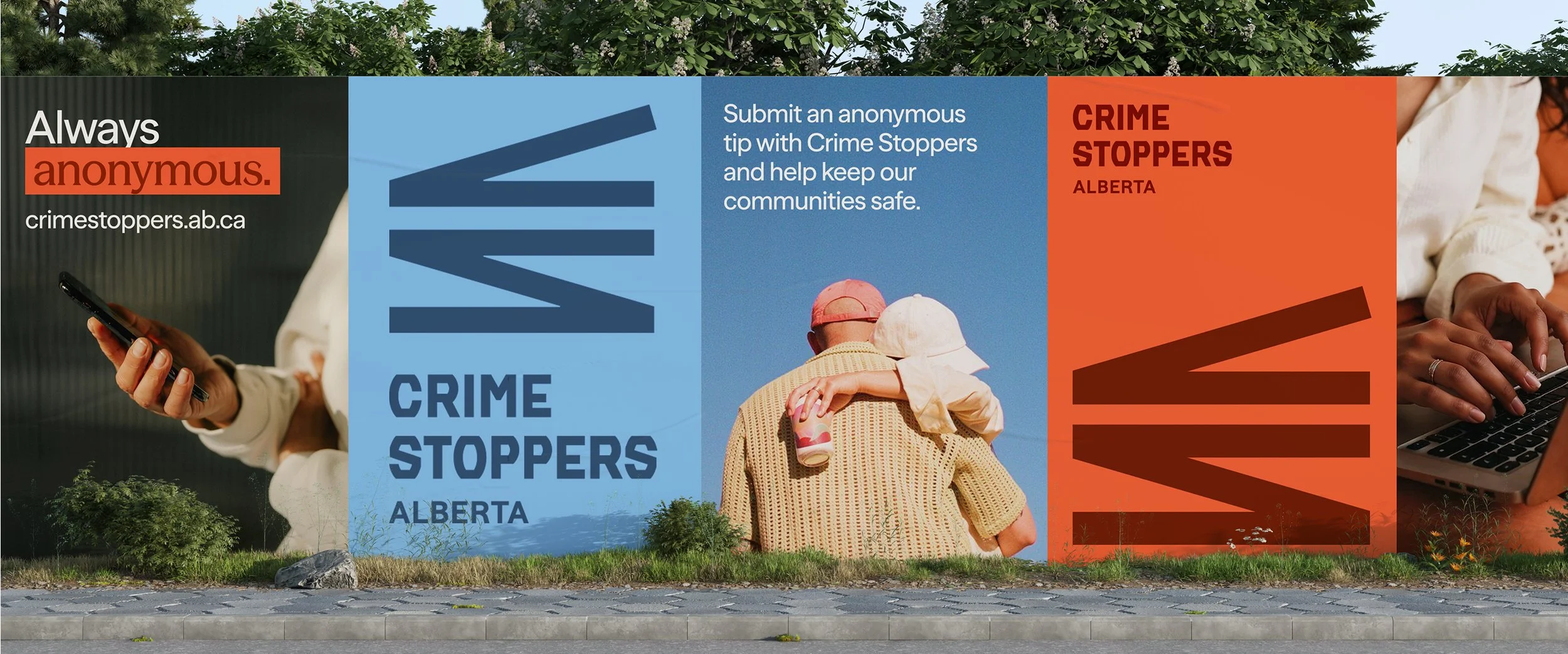
Safety isn't just the absence of crime. It's the presence of connection. We've been working to build safer communities in Alberta since 1982. We changed our look to reflect our passion for empowering individuals, inspiring communication, and improving people's experience within their community through engagement.
Where we started:
An identity that needed to catch up with our mission.
For a long time, our logo featured a silhouette behind bars. We understand why: it communicated authority, law enforcement, consequences.
But that framing may have created hesitation for some members within the community, and the truth is Crime Stoppers has always been about fighting for safer communities. We strive to engage a broad audience and wanted our webpage to reflect our end goal.


The goals behind every decision
What the new brand needed to accomplish
Each decision around this rebrand, big and small, was shaped by the communities we serve and the work we've always done. This is just the look finally catching up. From the brandmark to the colour palette to the words on this page, every choice was grounded in six core goals that reflect who we serve and what we're here to do.
-
Reduce hesitation to act
Sharing information should feel simple, safe, and judgement-free—the barrier shouldn't be fear of what comes next.
-
Build trust through clarity
Reinforce that information is always handled with care and discretion. Anonymity isn't just a feature, it's our foundation.
-
Strengthen recognition
Build a consistent, cohesive identity that people across Alberta can quickly identify, recall, and trust.
-
Signal our why: community safety
We exist to inform and empower: passing tips to the right authorities, and equipping communities with the knowledge to recognize and respond to what affects their safety. We work alongside Albertans, not above them.
-
Improve usability across touchpoints
Our digital presence needed an upgrade. The new system is built to be easy to understand, easy to navigate, and easy to apply across every channel.
-
Create an adoptable system
Deliver tools and assets that scale consistently across all mediums: built for real-world use by our team of volunteers.
The thinking behind the look
Three themes that shaped everything
The visual language of the new brand emerged from listening: to the people who use Crime Stoppers, to the communities we serve, and to what safety actually feels like when it's working.
01.
Connected by design
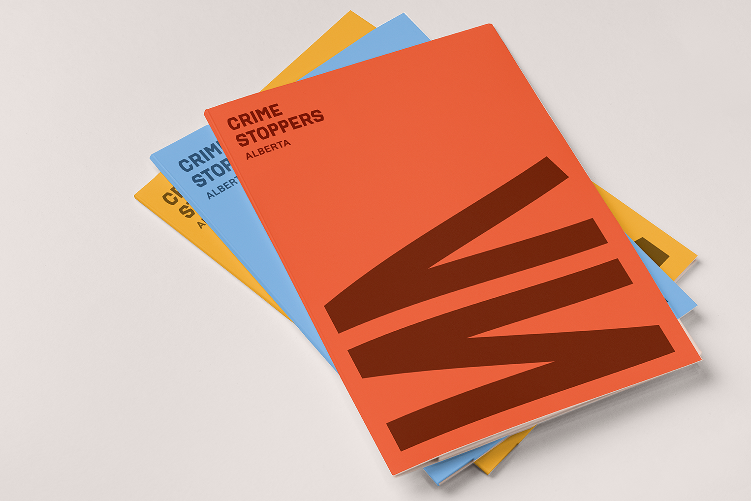
The idea started with something most of us haven't seen in a while: the coiled spiral cord of a telephone, that tactile, physical thing that once tethered us to each other. There's something fitting about that nostalgia, a reminder that connection with each other is the whole point.
From there the idea evolved. The structured, geometric form you see now grew to include pathways, shared spaces, and the visual language of highlighting: the way important information gets marked as worth noticing. Because that's exactly what a community does when it's working: people pay attention, flag what matters, and pass it along.
02.
Community & belonging
When people feel safe, they live more freely. Neighbours meet. Kids play outside. Business starts. We wanted a brand that reflects the warmth of what we're actually protecting: not just the absence of crime, but the presence of real life.
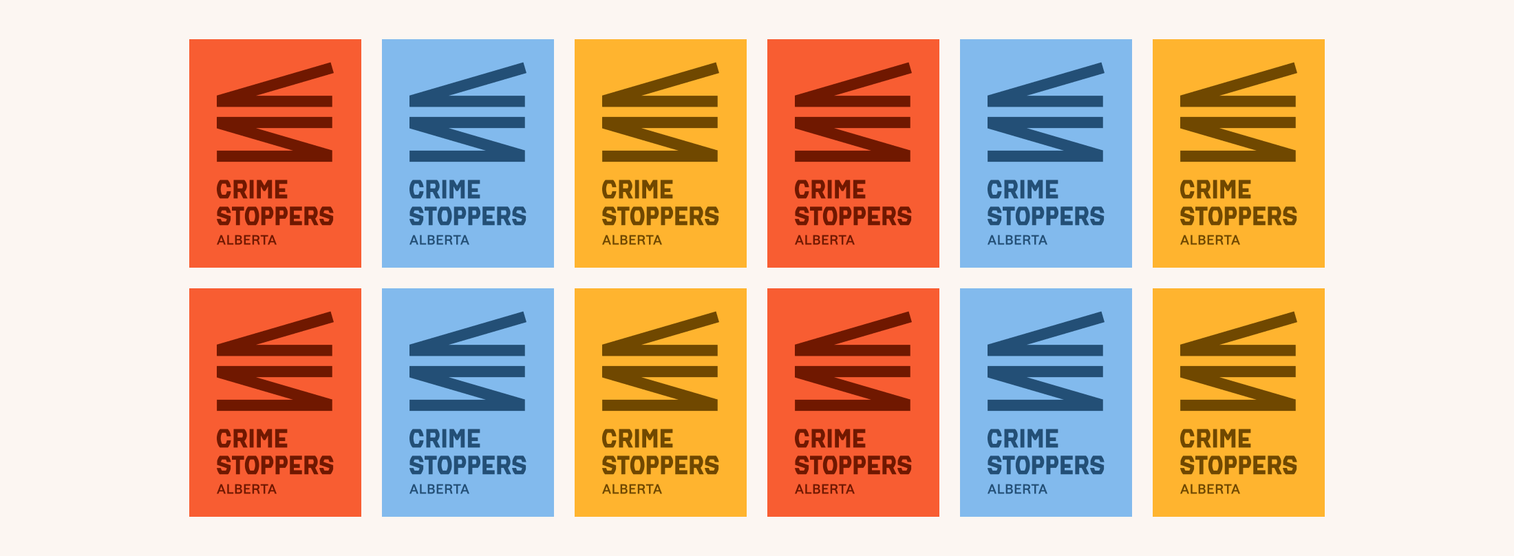
The colour palette was drawn from the land itself. Soft sky blues. Prairie creams. Burnt reds and harvest yellows. These aren't arbitrary choices, they're grounded in a place that Albertans already feel at home in. There's a deliberate softness to it that might surprise you coming from a crime prevention organization. But that softness is the point. Albertans are bold, direct people, and the connection that underpins everything Crime Stoppers does is tender. It's a neighbour choosing to speak up. It's a stranger deciding to trust. We wanted the brand to hold space for that.

03.
Anonymity & invisibility
Anonymity is the foundation everything else is built on. Without it, people hesitate. And when people hesitate, communities miss out on the information that could make them safer.
The visual language of the brand reflects this quietly: highlighting draws attention to what matters, while the person behind the information stays invisible. That's the whole idea. You notice something, you pass it along, and you stay protected. Simple, safe, and easy.

The bigger pictureSafety compounds
We believe safety has a compounding effect. When people feel safe, they connect more. When they connect more, opportunity grows. When opportunity grows, the pull toward crime diminishes: in part because the conditions that breed it start to dissolve.
That's the vision underneath this brand and what we do. A community where people from every background feel safe enough to live in connection with each other. To look a neighbour in the eye. To let their kids run to the park. To build something together.
The new identity of Alberta Crime Stoppers is a reflection of that belief: that safety doesn't exist without community, and community can't fully thrive without safety.
-
Support the work
Crime Stoppers runs on the generosity of people who believe in safer communities. Every contribution helps.
-
Get involved
There are many ways to be part of this, from volunteering your time to spreading the word in your community.
-
Share what you know
You don't need to be certain. You just need to notice. Tips of any size help us and our partners build a clearer picture.